Playing around with Angular 2, I thought that a star-like rating component would be very useful. The idea was to have a rating component for any item within a table or a repeated structure and to be able to rank any of the repeated items in the same page. I put together radio buttons, labels and a lot of CSS to give it the rating stars appearance.
Component class
For the rating component class, apart from importing the Component module from angular2, I also imported 3 additional modules that would allow me to communicate between the container component and the rating component. The other modules I imported from angular2 are:
- The Input module, a decorator used to indicate what properties will be passed from the container component(App) to the nested component(Rating). I used this decorator to pass the item ID and the rating. (These properties are one-way binding, so it only goes from the container component to the nested component)
- The Output module, a decorator used to pass data from the nested component(Rating) to the Container component(App). In order to be able to send data back to the container, the output property type must be an event.
- The EventEmitter module, a component used to instantiate a new event object for the output property.
There’s nothing new about the @Component decorator. It has the usual selector, template URL and CSS ref array.
For the radio buttons name, I created a string variable that would contain the name for all the radio buttons in each nested component. The name was a concatenation of the item ID and ‘_rating’, and the value for this variable was assigned within the ngOnInit event. You can find a very nice article about the angular 2 component lifecycle here.
Another thing worth mentioning is the click event. The event receives a number, which is the clicked rating. Then, after setting the rating component local variable with the new clicked rating, it emits an event with an object containing the information of the clicked rating. Notice that the event emitter object was set to return an object of type any, but I could have set it to return anything I wanted (string, number, etc).
1 | import { Component, Input, Output, EventEmitter } from 'angular2/core' |
Component Template
For the template I put together a radio button and a label for each rating (star). Both, the radio button and the label, had its own properties to make the component work properly, as follows:
The radio buttons
- The type attribute set to radio
- The value attribute for each rating level.
- The name attribute bound to imputsName property of the rating component.
- The checked attribute that compares the current rating with the value of the radio button.
The labels
- The title attribute with some text according to its rating level.
- The click event sending the rating level as a parameter on click.
1 | <fieldset class="rating"> |
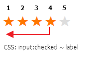
Notice on the HTML that I started from the highest rating to the lowest. This would help me apply the CSS styles to ratings lower than the clicked/hovered rating using the “~” css selector and then just inverted the order with CSS in order to make it appear from 1 to 5.
The click event was bound to the labels instead of the radio buttons because the radio buttons are hidden by CSS styles and the user would actually click the labels.
Component styles
The styles played a very important role for this component as it gave the template a stars-like rating appearance. I added comments over each rule within the code.
I decided to put the HTML radio buttons in descending order because it would allow me to select siblings star labels by using the “~” symbols.
For example, if the rating 4 is checked/hovered, the following ratings 3, 2 and 1 will be selected by the CSS rule and will have the same colour.
1 | /*************************** |
Using the component
Once all the elements for the rating components were ready, it was time to put the component in use.
Within a for loop, I added the app-rating tag, which is the selector specified on the rating component. I also included the following attributes:
- Rating: the current item rating for the nested component.
- ItemId: the current item ID for the itemId of the rating component.
- RatingClick: the event to be triggered on rating click. Notice that as a parameter I specified an “$event” parameter. This is what the event emitter from the rating component will return.
1
2
3
4
5
6
7
8
9
10<tr *ngFor="#item of items">
...
<td>
<app-rating [rating]='item.rating'
[itemId]='item.id'
(ratingClick)='ratingComponetClick($event)'>
</app-rating>
</td>
...
</tr>
On the container component class, I imported the rating component and for it to be available within the template, I also included the component in the directives array.
Lastly, I wrote a simple function that would receive an object of type any sent by the rating component. In this function is where I would update the item.
1 | ... |
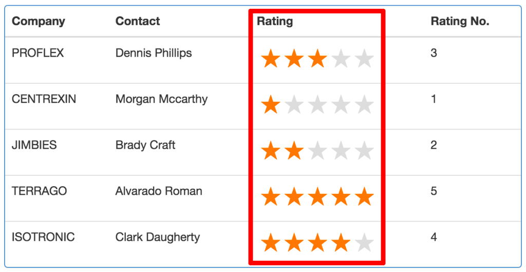
And that’s it! Have a look at the live demo to see how it works.
Live Demo
Here is a demo of a basic table that uses the component. Give it a try!
Code
You can find the code here.
Hope you like it and find it helpful.